I realized recently that I don’t have a data science ‘portfolio.’ Most of the analysis that I’ve done is usually for work and since it contains company data it’s not something that I can normally share publicly.
So recently I’ve began working more on pieces that I can share to display my analysis chops.
This most recent dataset is an analysis of White House Salaries between 2001 and 2017, save 2002, which I couldn’t find online. (If you’re able to find a copy, please send it to me and let me know. Thanks!).
First I began just by looking at staff sizes and median pay of all employees by year, president and party.
You can see how things have changed since 2001 in these two charts:
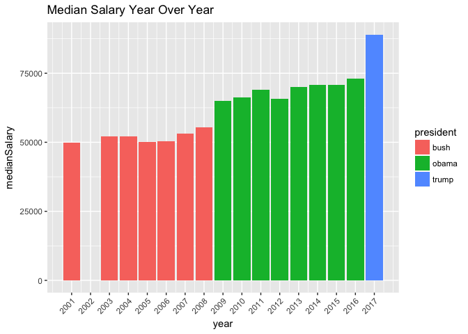
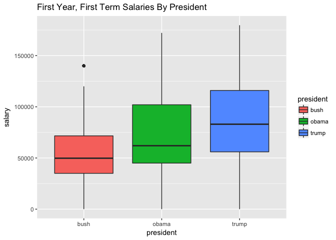
Interestingly enough, the charts represent the exact same data, but visualize it differently. Most people are use to the bar chart, while the boxplot gives you a much better view of what’s going on.
You can read more about my first term analysis here.
This part of the project was fun because I got to use the
Rvest library for the first time.
I also used the tried and true tidyverse and magrittr packages. Magrittr
might be one of my favorite packages because of how concise you can be with your
code. Here’s an example
salaries <-
  salaries %>%
    mutate(year = year(start_date))
With Magrittr you can shorten your code by using %<>%:
  salaries %<>%
    mutate(year = year(start_date))
Not that it’s a big deal, I think it just makes things more readable.