Recently I finished up a small project that where I was analyzing annual rent prices in Colorado.
I got the idea to start investigating open data in Colorado from the app building event, Go Code Colorado.
Automating Charts
With most analysis projects, you would always want to start out by doing an
exploratory data analysis
of your information. One huge pet peeve that I have is doing things manually so
I thought this would be a good opportunity to explore how I might begin visualizing
rent changes over time with some simple R code.
This piece of code is pretty straight forward. Here I’m using a very simple
for loop to get each unique Colorado subregion, Fort Collins/Loveland for
example. Within the for loop, I’ve using dplyr and ggplot2 to build a simple
line chart of rent with a grepl filter for the specific i subregion like:
filter(grepl(paste(i, sep =""), subregion, fixed = TRUE)).
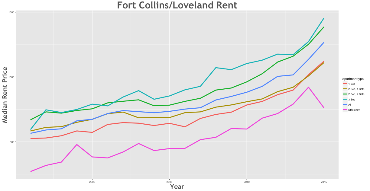
That code would produce a chart like this for each subregion:
Automating Reports
The next piece of the puzzle was to figure out how I might automate a short analysis using the “structured” or “templated” data I had available.
At first, I wanted to know for each subregion, which apartment type saw the largest increase in rent prices over time.
For that I can just measure the percent change using the formula:
delta = round(sum(
max(averagerent[year == max(year)]) -
min(averagerent[year == min(year)])) /
min(averagerent[year == min(year)]) * 100, 2)
After finding these metrics, I was able to come up with an algorithm to describe
the changes in rent prices across all sub regions of Colorado. Using a basic
R markdown template, I was able to create a very simple, repeatable report.
This code is another for loop that will create all of the analyses for me.
If you wanted to extend the logic on a project like this further, you could.
Issues
One of the things that you’ll immediately see is that on the surface it doesn’t allow much customization of the reports, but I’ve been spending some time thinking through how you might solve that. I haven’t come up with the perfect solution yet, but I’ve been working on some ideas.
Inception
Originally I came up with this idea when I read about the work Narrative Science was doing with Natural Language Generation and creating stories from box scores.
This was before I knew about Narrative Science but at the time I realized that descriptive statistics like Google Analytics and reports that we write for businesses could be written and complied in the same fashion.
I’ve been working on my own idea for something like this that we could use at my office to quickly supply reports and analyses without a lot of man hours involved using static sites or something more dynamic like a shiny app.
This project is as close as I’ve come to sharing that vision.