In A Sentimental Mood
Chip Oglesby 2018-05-02
ACT ONE: IN A SENTIMENTAL MOOD
To begin our analysis, we will import all of the subtitles for the television show Frasier. This includes 11 seasons and 264 episodes.
After importing the files usings the subtools package we will agument our data with information from IMDB.com.
We are using the tidytext package to perform a sentiment analysis on the subtitles.
Let’s get started:
subtitles %>%
  unnest_tokens(word, text) %>%
  anti_join(stop_words) -> tidySubtitles
First we’ll unnest all of the words in our data frame and create tokens for each word using the code above.
Let’s look at the top ten words across all 11 seasons:
tidySubtitles %>%
  filter(!grepl('frasier|roz|daphne|martin|niles|dad|crane|dr', word)) %>%
  count(word, sort = TRUE) %>%
  top_n(10, n) %>%
  knitr::kable()
| word | n |
|---|---|
| time | 1721 |
| yeah | 1689 |
| uh | 1274 |
| hey | 1240 |
| god | 1055 |
| love | 918 |
| night | 854 |
| people | 767 |
| gonna | 762 |
| call | 745 |
After excluding some of the more common character names, this is our top ten list. We would expect words like time and call since Frasier’s job is a radio host.
I also suspect that “God” is commonly used by Frasier as one of his catch phrases “Oh My God!”
We’ll know for sure once we’ve analyzed the transcripts, but let’s take a peek:
| text | n |
|---|---|
| oh, my god | 65 |
| oh, dear god | 44 |
| oh, god | 18 |
| dear god | 12 |
| for god’s sake | 7 |
Adding the Bing lexicon for sentiment analysis, we can then begin to get a picture of what some of the sentiment includes. Let’s take another look:
| word | sentiment | n |
|---|---|---|
| love | positive | 918 |
| nice | positive | 668 |
| fine | positive | 504 |
| excuse | negative | 440 |
| bad | negative | 434 |
| wrong | negative | 373 |
| happy | positive | 361 |
| hell | negative | 328 |
| ready | positive | 304 |
| afraid | negative | 279 |
| fun | positive | 279 |
Now that we’ve labled words into a binary fashion, positive or negative we can take this data and create an algorithm that will help us plot this information for a time-series analysis.
To do that, I will create new variables called dateTimeIn and dateTimeOut.
We can do this by using dplyr to mutate the information we have.
subtitles %<>%
mutate(dateTimeIn = ymd_hms(paste0(originalAirDate, timecodeIn)),
       dateTimeOut = ymd_hms(paste0(originalAirDate, timecodeOut))
This will take our date, 1993-09-16 and our timecodeOut, 00:00:11.951 and give us 1993-09-16 00:00:11, which we can then use to plot our data for any episode and season.
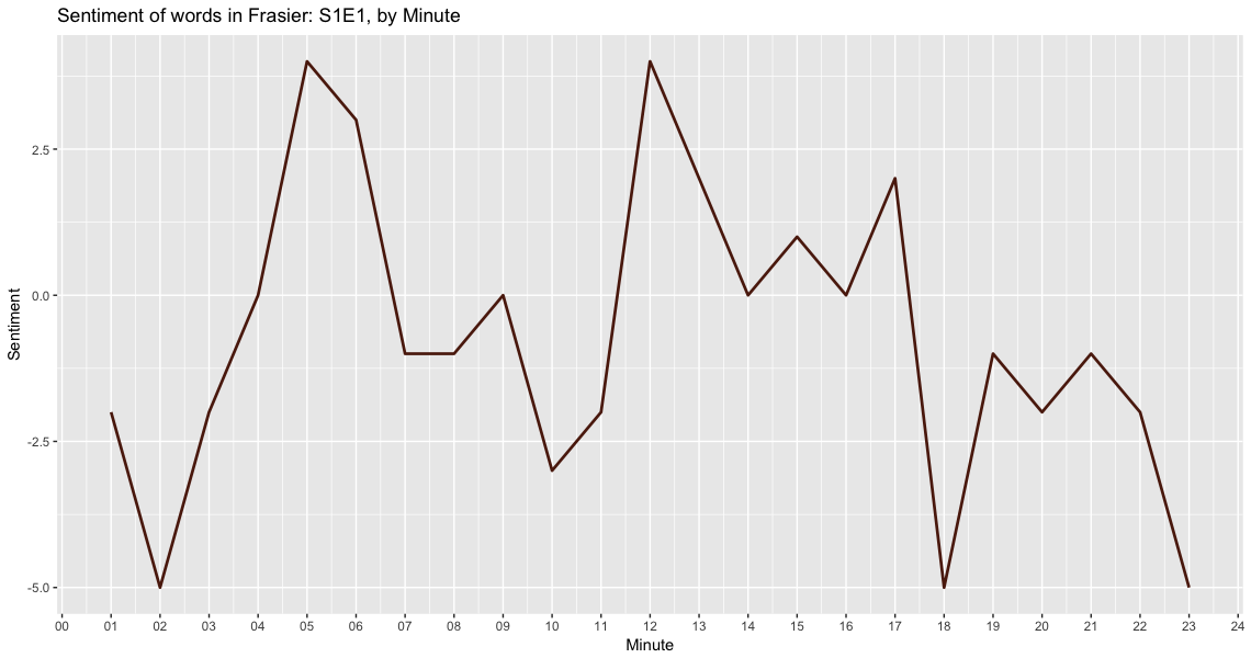
In this graph, I’m using an algorithm that creates a minute difference between the first and last timestamp of each episode and then calcuates the polarity of words being spoken during each minute with sentiment = positive - negative word counts.
Now we have our first visualization at the sentiment of words during each minute of the show.
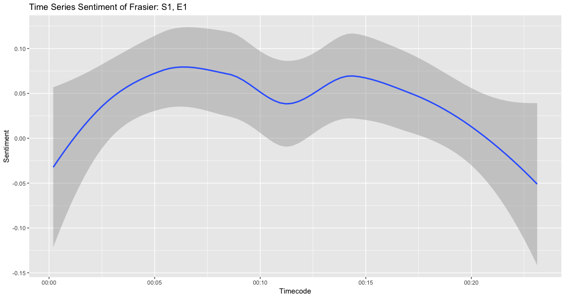
While the individual sentiment analysis of a word is interesting, what would be more interesting is the analysis of each sentence overall.
To help with this, we’ll use the sentimentr package on Github.
Now we can use the code below to get the over all average sentiment of each sentence which will give us a better calculation for sentiment than just single words.
subtitles %>%
  filter(season == 1) %>%
  mutate(sentences = get_sentences(text)) %$%
  sentiment_by(sentences, list(season, episode)) %>%
  knitr::kable()
| season | episode | word_count | sd | ave_sentiment |
|---|---|---|---|---|
| 1 | 1 | 2641 | 0.2287571 | 0.0800368 |
| 1 | 2 | 2865 | 0.2669024 | 0.1006411 |
| 1 | 3 | 3303 | 0.2757897 | 0.1439134 |
| 1 | 4 | 3325 | 0.2516266 | 0.0938251 |
| 1 | 5 | 3413 | 0.2083973 | 0.1313697 |
| 1 | 6 | 2428 | 0.2589560 | 0.1046161 |
| 1 | 7 | 2474 | 0.2378644 | 0.0984380 |
| 1 | 8 | 2535 | 0.2793574 | 0.1045188 |
| 1 | 9 | 2584 | 0.2901932 | 0.0565543 |
| 1 | 10 | 2264 | 0.2871554 | 0.1395152 |
| 1 | 11 | 2323 | 0.2563188 | 0.0648546 |
| 1 | 12 | 2379 | 0.2799138 | 0.1633886 |
| 1 | 13 | 2495 | 0.2807880 | 0.1651235 |
| 1 | 14 | 2298 | 0.2208333 | 0.1052322 |
| 1 | 15 | 2584 | 0.2901932 | 0.0565543 |
| 1 | 16 | 2264 | 0.2871554 | 0.1395152 |
| 1 | 17 | 2401 | 0.2736018 | 0.1394788 |
| 1 | 18 | 2379 | 0.2799138 | 0.1633886 |
| 1 | 19 | 2656 | 0.2630231 | 0.0768660 |
| 1 | 20 | 2616 | 0.2441385 | 0.1279380 |
| 1 | 21 | 2586 | 0.2469800 | 0.1052640 |
| 1 | 22 | 2508 | 0.2496631 | 0.1098577 |
| 1 | 23 | 2694 | 0.2813022 | 0.1024440 |
| 1 | 24 | 2724 | 0.2433418 | 0.1175034 |
When we break it out by minute, we can graph the average sentiment per minute:
Term Frequency
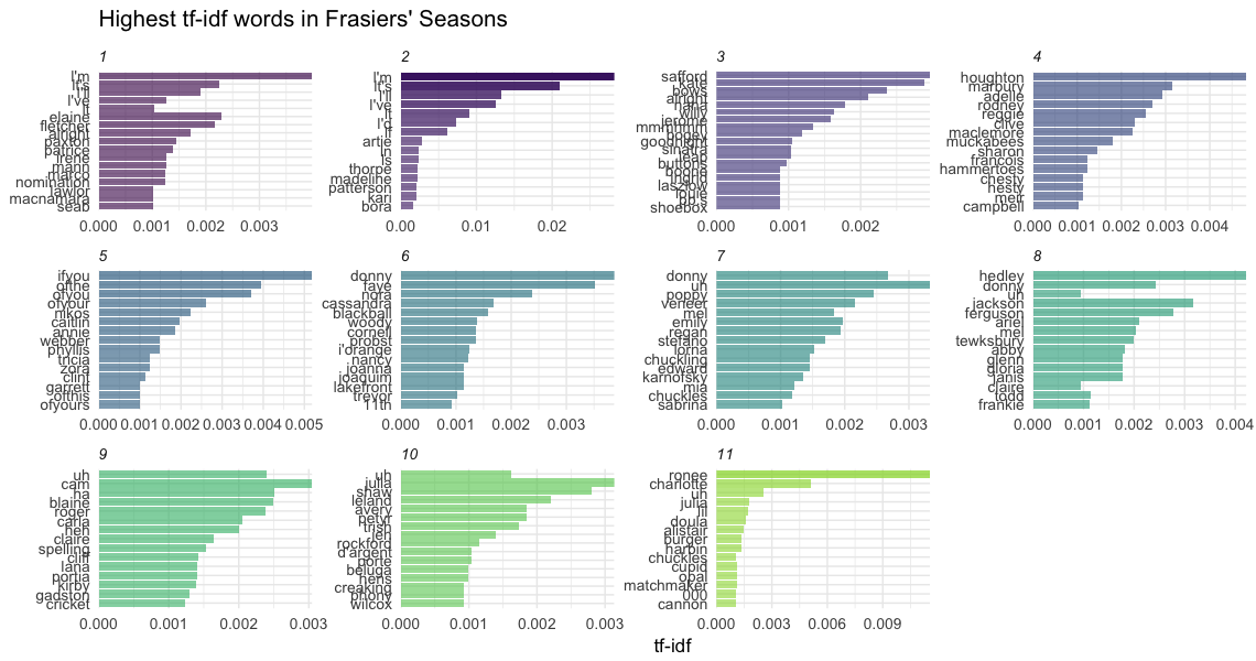
Now let’s look at the term frequency inverse document frequency or TF-IDF of the words in our analysis. TF-IDF is the frequency for how rarely a word is used and measures how important a word is in a corpus.
tidySubtitles %>%
  count(season, word, sort = TRUE) %>%
  group_by(season) %>%
  mutate(total = sum(n),
         nTotal = n/total) %>%
  ungroup() %>%
  top_n(10, n) %>%
  knitr::kable()
| season | word | n | total | nTotal |
|---|---|---|---|---|
| 6 | niles | 419 | 21179 | 0.0197837 |
| 2 | l’m | 414 | 19063 | 0.0217175 |
| 8 | niles | 399 | 21577 | 0.0184919 |
| 8 | frasier | 389 | 21577 | 0.0180285 |
| 9 | frasier | 354 | 22159 | 0.0159755 |
| 7 | uh | 351 | 21163 | 0.0165856 |
| 7 | frasier | 346 | 21163 | 0.0163493 |
| 10 | niles | 333 | 20713 | 0.0160769 |
| 11 | niles | 322 | 20959 | 0.0153633 |
| 7 | niles | 321 | 21163 | 0.0151680 |
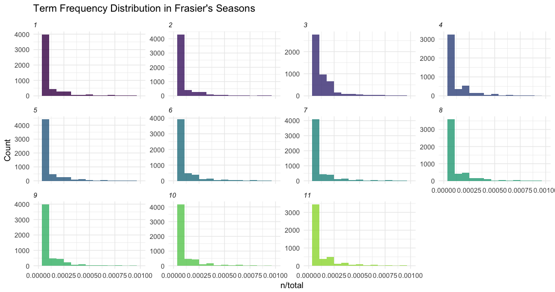
From the chart we can see that the data is highly right skewed with more common words. Many of the words occur frequently and some rarely occur.
What could some of those words be?
In our next analysis, we’ll be digging into the transcripts to get a better idea of who’s saying what and more exciting work!
I’d like to thank Pachá for sharing their code that allowed me to create the charts for the TF-IDF work.